Background
For the past 2 summers that I have been in the Department of City Planning, our Design team has hosted two Coding it Forward (CIF) fellows every year. Because of different COVID policies across the host offices in America, the program opted to have the fellowship take place virtually to make the opportunity as equitable as possible. With our design fellows working virtually, I wanted to give them a physical space to better connect with us—but virtually.
Scope
New Feature
Role
Visual Designer
Duration
May 2022 & May 2023
Design Solution
In 2022, while participating in Figma’s Config, I listened to several talks that mentioned how in the midst of COVID their teams had to adapt to virtual spaces to connect. So with that in mind, I leveraged LabKit and its components to curate a virtual space for our fellows.
To curate these spaces, I looked through our fellows’ Design Portfolio and included elements that spoke to their interests and hobbies. I also included their pictures and a call back to either their UX/UI work or their artwork.
2022 CIF Dashboard
This first iteration included 4 rooms with a different purpose:
-
Kitchen: This was meant to mimic our physical office and how a lot of socialization in our department happens there. This virtual room was the designated space for ice breakers.
-
Design Corner: The Design Corner was meant to be a place where the fellows can go to quickly reference important dates or org charts. This space also became a spot where we placed notes while collaborating.
-
Lounge area: This was just another room they can explore to reference important links and play games.
-
Space room: A fun space to think about their weekly goals and what they wanted to achieve during the fellowship.
2023 CIF Dashboard
This year, I opted for three rooms:
-
Kitchen/Lounge area: Just like last year, we spent time in this space for ice breakers.
-
Office: A small area where the fellows can reference important information they may need throughout the summer.
-
Design room: A more personalized “Design Corner” from last year. Each fellow has their own personalized desk setup with the goal section from the Space room last year above their respective desks. There’s also a more specific space for collaboration with the white board since we did use the room for that last year.
Design Solutions
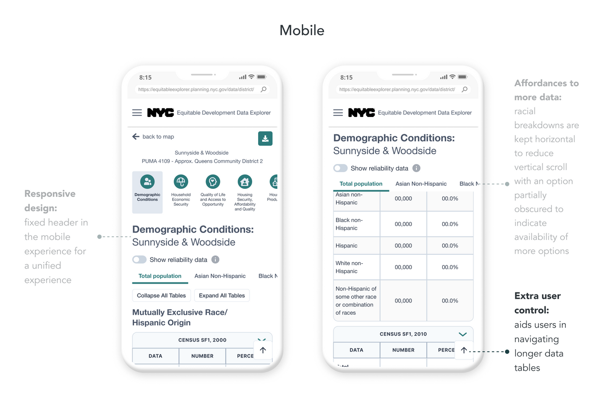
Clearer context of use through navigation
We found points of friction in navigation and context of use:
-
Users don’t engage with the dropdown that switches between racial breakdown datasets
-
Users spend time having to scroll up for context on the dataset they’re reviewing
-
Users have to spend time having to scroll up just to switch between datasets
Unblocked user flow
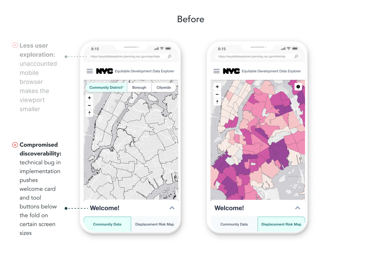
According to Google Analytics, 25% of our users were coming from mobile, making it essential to have a seamless mobile flow. While investigating why only 20% of those users were expanding the Welcome card, we discovered the Welcome card along with the data tool buttons were obscured below the viewport on certain device sizes. This prevented users from accessing datasets.
Easier comparison across maps
The Community Data and Displacement Risk Map contain datasets that are broken down at different geographic boundaries. When users try to search or compare a geographic area on one side of the tool, they often rely on external PDF maps or tools as a guide for the other side's geographic boundaries.
The new Additional Layers feature allows users to add to toggle contextual layers on top of the map, empowering them to:
-
Save time by staying within the tool during their entire user flow
-
Have references to geographic breakdowns of both sides of the tool accessible
-
Easily compare between the two different geographic areas
Increased efficiency with tooltips
Throughout usability testing, users spent a significant amount of time clicking around the map to get to the area they needed. Since our users were looking for certain geographic areas instead of specific addresses, we opted for tooltips.
Reflection & Takeaways
Both years, the fellows have seemed to genuinely like and appreciate the space. When they saw it for the first time, they excitedly zoomed around the space to find all the personalized easter eggs for each of them.
The dashboards became a space that provides the Design team with a structure to use when starting the fellowship. It also became a fun space to use for ice breakers.
However, its usefulness depended on what was happening during the summer. One summer we used it weekly especially for reflections. With the other summer, which was busier, we only used it a few times.
Though the entire experience was extremely fun and brought joy to our fellows, with changing COVID protocols changing, there might not be a need to continue making them in the future.


