Streamlining data analysis and navigation for complex datasets
Developed features that empower everyday New Yorkers to compare, analyze, and create narratives from accessible equity datasets.
Streamlining data comparison and navigation
Empowering everyday New Yorkers with features that allow them to compare, analyze, and create narratives from accessible equity datasets.
What my role was: End-to-end UX/UI Designer
Who I worked with: 2 UX/UI Designers, 1 Product Manager, 3 Engineers, 1 QA Analyst, 1 Data Analytics Officer/Engineer
How long the project was: 3 Months (August - November 2022)
What I did: UX Research, UI Design

Project Overview & Problem
The Equitable Development Data Explorer (EDDE) is a responsive web application that aims to provide New Yorkers with accessible data on housing affordability, displacement, and racial equity in New York City. The MVP of the product was released in April 2022.
The initial target users were land use applicants who needed datasets for material required by NYC’s uniform land use review process. However, when we launched the MVP, we noticed that a more diverse set of users were actively engaging with the tool.
With their experience in mind, we needed to provide an easier way for users to navigate complex data.
Scope
New Features
Role
UX Research, UI Design, Interaction Design, Usability Testing
Team
2 UX/UI Designers, 1 Product Manager, 3 Engineers, 1 QA Analyst, 1 Data Analytics Engineer
Duration
3 Months (August - November 2022)
Insights
-
Advocate users were confused on purpose of the dropdown on the data tables page
-
Super users had a difficult time comparing datasets from the Community Data and Displacement Risk Map side of the tool with their different geographic breakdowns
-
Both Both user groups spent time clicking around to orient themselves and find a certain geographic area
Research
Understanding our users
We narrowed down our target users to 2 groups and conducted 3 rounds of usability testing to understand their friction points.
Super Users
-
Works at a city agency
-
Uses the tool almost every day
-
Relies on the tool to provide context on understanding neighborhoods and expedite work tasks
-
Main Friction point:
-
Accustomed to more data comparison features and has to rely on external tools to compare data produced by the application
-
Advocate Users
-
Member of a special interest group or non-profit
-
Uses the tool once every couple of weeks
-
Curious about how different neighborhood datasets compare to each other
-
Main Friction Point:
-
Not familiar with the geographic locations of all NYC neighborhoods and spends a lot of time clicking around the application to get oriented
-
Synthesizing data and pulling insights
Through Google Analytics and Affinity Diagrams, some high-level findings we discovered were:
-
Lack of affordances: Advocate users did not interact with features that were not clearly labeled, specifically the dropdown on the data tables page that provides extra data
-
Limited data comparison: Super users used both maps in tandem to accomplish work tasks but faced challenges in comparing data between the maps due to the lack of interoperability
-
Disorienting start: Both user groups started off their experiences clicking around to orient themselves in order to locate specific geographic areas within the tool due to a lack of affordances

Design Solutions
Clearer context of use through navigation
We found points of friction in navigation and context of use:
-
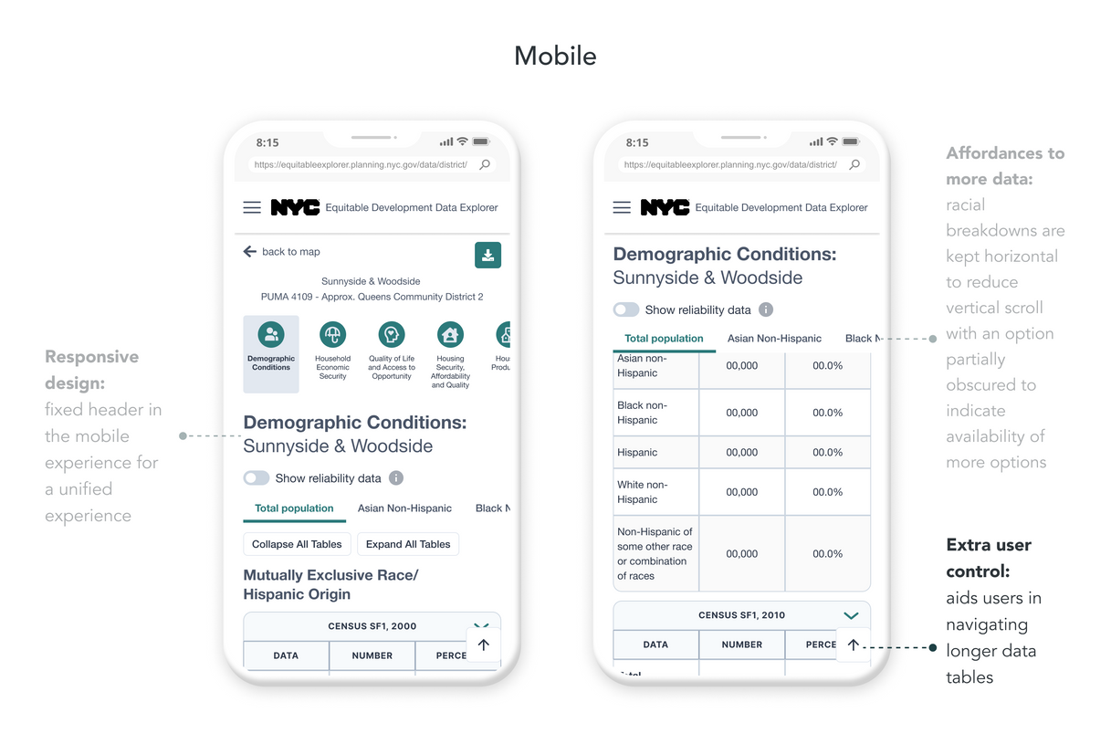
Users don’t engage with the dropdown that switches between racial breakdown datasets
-
Users spend time having to scroll up for context on the dataset they’re reviewing
-
Users have to spend time having to scroll up just to switch between datasets
.png)
Easier comparison across maps
The EDDE has two map tools (Community Data and Displacement Risk Map) which are broken down at different geographic boundaries due to data constraints. During testing, we noticed that when users try to compare a geographic area on one side of the tool to the other, they often rely on external PDF maps or tools as a guide.
The new Additional Layers feature allows users to toggle contextual layers on top of the maps, empowering them to:
-
Save time by staying within the tool during their entire user flow
-
Have accessible references to geographic breakdowns for both sides of the tool
-
Easily compare the geographic areas between two different maps
Increased efficiency with tooltips
Throughout usability testing, users spent a significant amount of time clicking around the map to get to the area they needed. Since our users were looking for certain geographic areas instead of specific addresses, we opted for tooltips.
Unblocked user flow
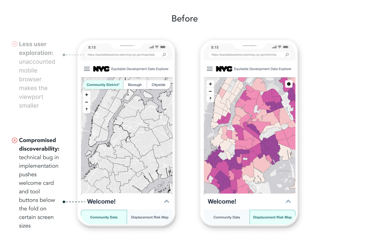
The Welcome card along with the data tool buttons were obscured below the viewport on certain device sizes which prevented users from clicking into datasets. With 25% of our users entering via mobile, it was essential to have a seamless mobile flow.
.png)
.png)
Design Solutions
Clearer context of use through navigation
We found points of friction in navigation and context of use:
-
Users don’t engage with the dropdown that switches between racial breakdown datasets
-
Users spend time having to scroll up for context on the dataset they’re reviewing
-
Users have to spend time having to scroll up just to switch between datasets
Unblocked user flow
According to Google Analytics, 25% of our users were coming from mobile, making it essential to have a seamless mobile flow. While investigating why only 20% of those users were expanding the Welcome card, we discovered the Welcome card along with the data tool buttons were obscured below the viewport on certain device sizes. This prevented users from accessing datasets.
Easier comparison across maps
The Community Data and Displacement Risk Map contain datasets that are broken down at different geographic boundaries. When users try to search or compare a geographic area on one side of the tool, they often rely on external PDF maps or tools as a guide for the other side's geographic boundaries.
The new Additional Layers feature allows users to add to toggle contextual layers on top of the map, empowering them to:
-
Save time by staying within the tool during their entire user flow
-
Have references to geographic breakdowns of both sides of the tool accessible
-
Easily compare between the two different geographic areas
Increased efficiency with tooltips
Throughout usability testing, users spent a significant amount of time clicking around the map to get to the area they needed. Since our users were looking for certain geographic areas instead of specific addresses, we opted for tooltips.
Results & Next Steps
After implementation, we received feedback from users that the changes have tremendously made their experience with the tool easier. It has also been referenced by Planetizen as one of the Top Website for Urban Planning in 2022.
However, if there is more time and resources in the future, there are more ideas I would love to explore:
-
Address search bar - to allow general public users to input their address instead of using the geographic boundaries super users and advocates are familiar with
-
Data filters and comparison - to provide users with the ability to compare chunks of datasets across different geographies without the need of an external tool
You can view the live site here.
.png)
.png)


